A functional ecommerce checkout page might seem like enough to move your merchandise, but the truth is that your ecommerce website should include several features to ensure that your visitors are convinced so that you can convert them into customers. In the simplest of terms, your checkout page should eliminate any friction between the “want” and the “have.” Let’s take a look at some features you may be missing.
Deliver Security
Before handing over their financial information, your buyers want to know their money is safe in your hands. The best way to do that is to provide security information, whether you link to your security policy or display the security information right there on the checkout page.
While many merchants still use third-party security, the more common—and up-to-date—option is to provide a secure HTTP connection, which shows in the address bar as HTTPS. This lets buyers know they’re safe, too. See how Old Navy does it in this example.

When the HTTPS isn’t visible, buyers will still the see the lock symbol, like this address bar from the Tiffany checkout page.

Without a secure connection, users may receive warnings from their browser that they’re entering an unsecure area. That makes 17% of potential buyers back away from shopping carts.
Provide Payment Options
The option to use a credit card for online purchases is actually an out-of-date payment method that could result in an abandoned cart. This is because of that dreaded friction—something that slows down the momentum of the purchase, and sometimes halts it completely. When a shopper is in the mood, they want to finish the transaction as quickly as possible, not dig around for their wallet to find the three-digit security code on their credit card.
In addition to credit card payments, consider adding online options, too, such as PayPal, Venmo, and Apple Pay. These payment options will allow buyers to continue straight through the order to completion without needing to stop for any reason—and that may be the very thing you need to avoid yet another abandoned cart.
Offer Free Shipping
The number one factor in the online shopping process that can stop a customer in their tracks is surprise shipping costs. This is especially true if they’re shopping for big-ticket items, as shipping costs can be higher than expected.
If you can afford to spring for shipping, offer free options. This might involve free shipping if they reach a payment threshold or if they’re willing to wait a little longer for standard shipping. As an added bonus for payment threshold choices, your buyers are likely to make additional purchases in order to meet the limit.
If you already have a low revenue margin, you do have other options. First, consider adding a higher margin to your profit in order to make shipping free. Buyers are definitely more likely to buy a $35 sweater with free shipping than a $30 sweater that they must pay shipping for.
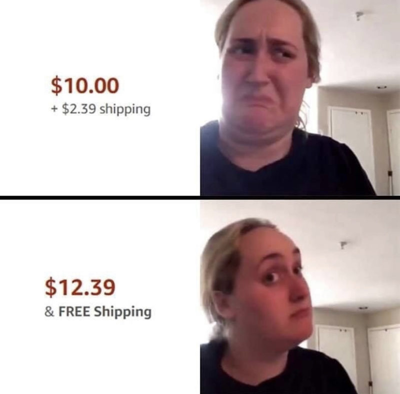
You can also provide a shipping calculator on your ecommerce checkout page before the purchase is finalized so that your buyers can determine their total costs before hitting the “order” button. This gives them the opportunity to then make additional purchases to meet the free shipping threshold or to determine if they have enough in their budget to complete the purchase.
With the three biggest contributors to purchase friction out of the way, it’s time to consider things you might do to increase purchase values.
Cross-Sell and Upsell
If you let buyers complete the checkout process without making additional product suggestions, then you’re leaving a lot of money on the table with every sale. For instance, would that phone they just purchased operate better if the customer bought specific cords or converters with it? What about external speakers or a new phone case?
Online clothing stores or jewelers can increase sales by showing images of items from the same collection. For instance, Draper James features clothing and accessories suggestions on each item’s page.
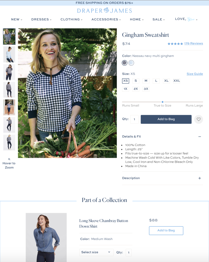
Also, check out that free shipping offer for orders over $75 at the top of the page. Yet another thing Draper James gets right.
Free Shipping Threshold
We mentioned this as an option for reducing purchase friction earlier, but giving a visual is a great way to prompt more purchases. By showing a gauge on your checkout page, you let buyers know how close they are to earning free shipping, so they can make the choice if they want to go choose another item or two. You can see what that looks like on Old Navy’s checkout page.
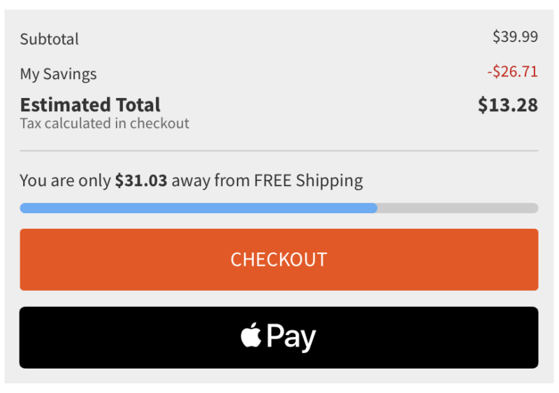
In many cases, buyers probably had their eye on something else but declined to purchase for cost reasons. When you give them visual confirmation of how their purchase could actually help them save money in the long run, they’re more likely to go back and snag the additional item.
Also, check out that Apple Pay option. Old Navy’s ecommerce game is on point.
Make Contact Info Easy to Find
There’s just one more big thing your ecommerce checkout page needs to convince and convert your buyers. Always make sure you have contact info on your checkout page and that it’s very easy to find. This not only aids in reducing friction, as buyers can get their questions answered quickly, but it also gives them reassurance that they can contact you after the sale, should something go wrong.
Phone and chat options are the most desirable, as it lends the appearance of a quick turnaround time. Be sure to include mailing address and email address information, too, especially if you’re a small company that isn’t constantly manning the phones and chat window.
These tips will help you increase your ecommerce sales, especially if you use them all together. If we can help you discover other ways to convince and convert your buyers, don’t hesitate to reach out.

